Beyond The Surface
Podcast
Cool people doing kind things.
The Challenge
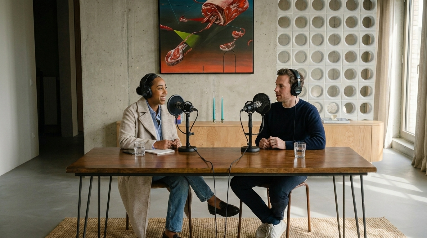
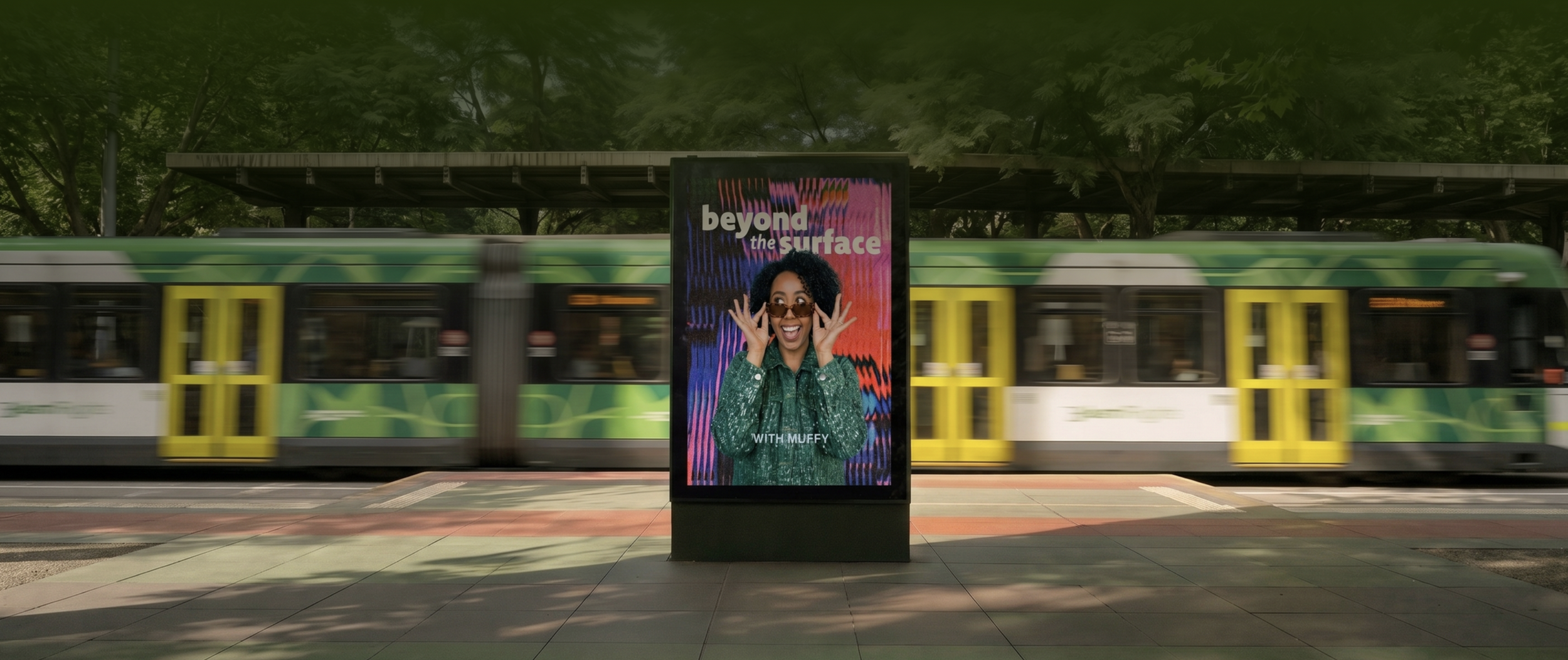
Muffy pitched a podcast to Westsider Radio and got the green light — Beyond the Surface spotlights the people in Melbourne's west doing good without any fanfare. She had a strong concept, a station slot, and an AI-drafted identity that read like a corporate psychology office. What she needed was a brand with warmth and personality — one a stranger would smile at and follow before episode one even aired.
The Solution
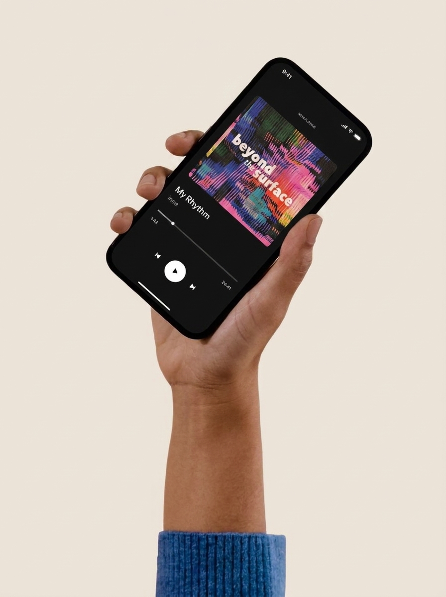
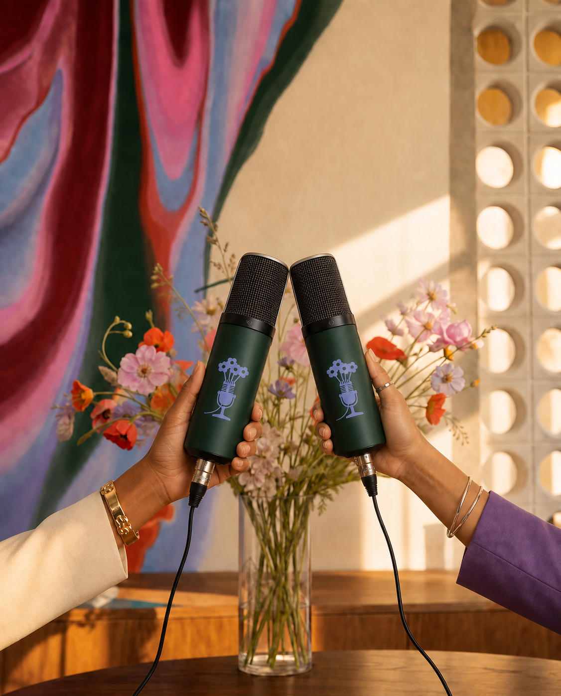
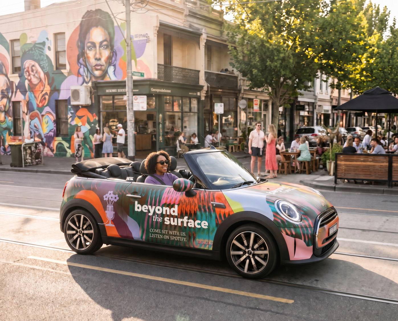
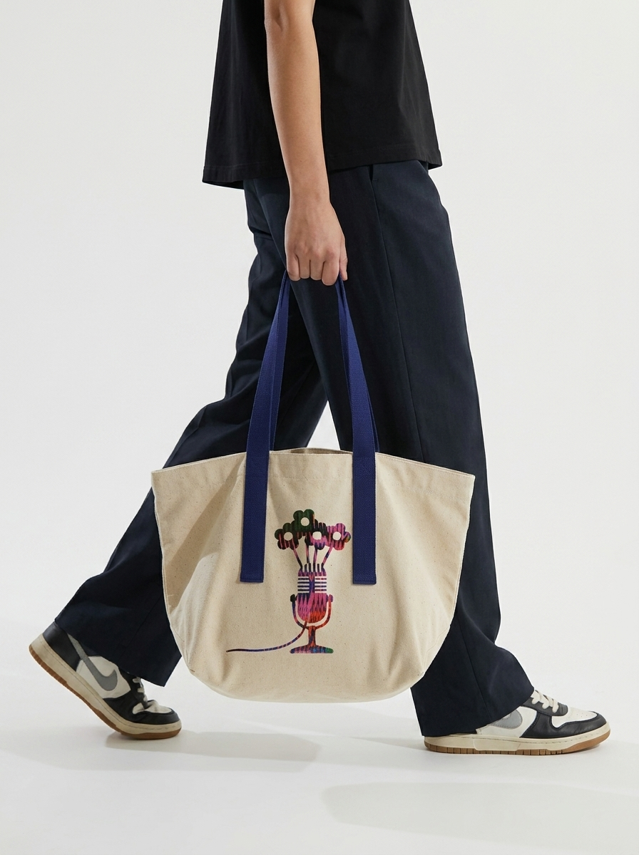
A full identity built around the show's own line: cool people doing kind things. Deep forest green, burgundy, periwinkle and vivid orange — expressive, human, and colour-blocked to keep Muffy prominent in every frame rather than competing with her. I sorted the brand architecture too: personal brand, House of Misky and Beyond the Surface as three clear tiers, so the mark stretches across the podcast, community events and art-for-good shows. Logo, palette, tone of voice, social feed — done.
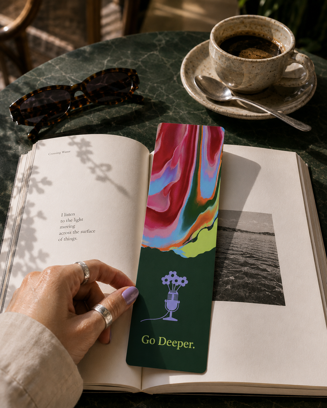
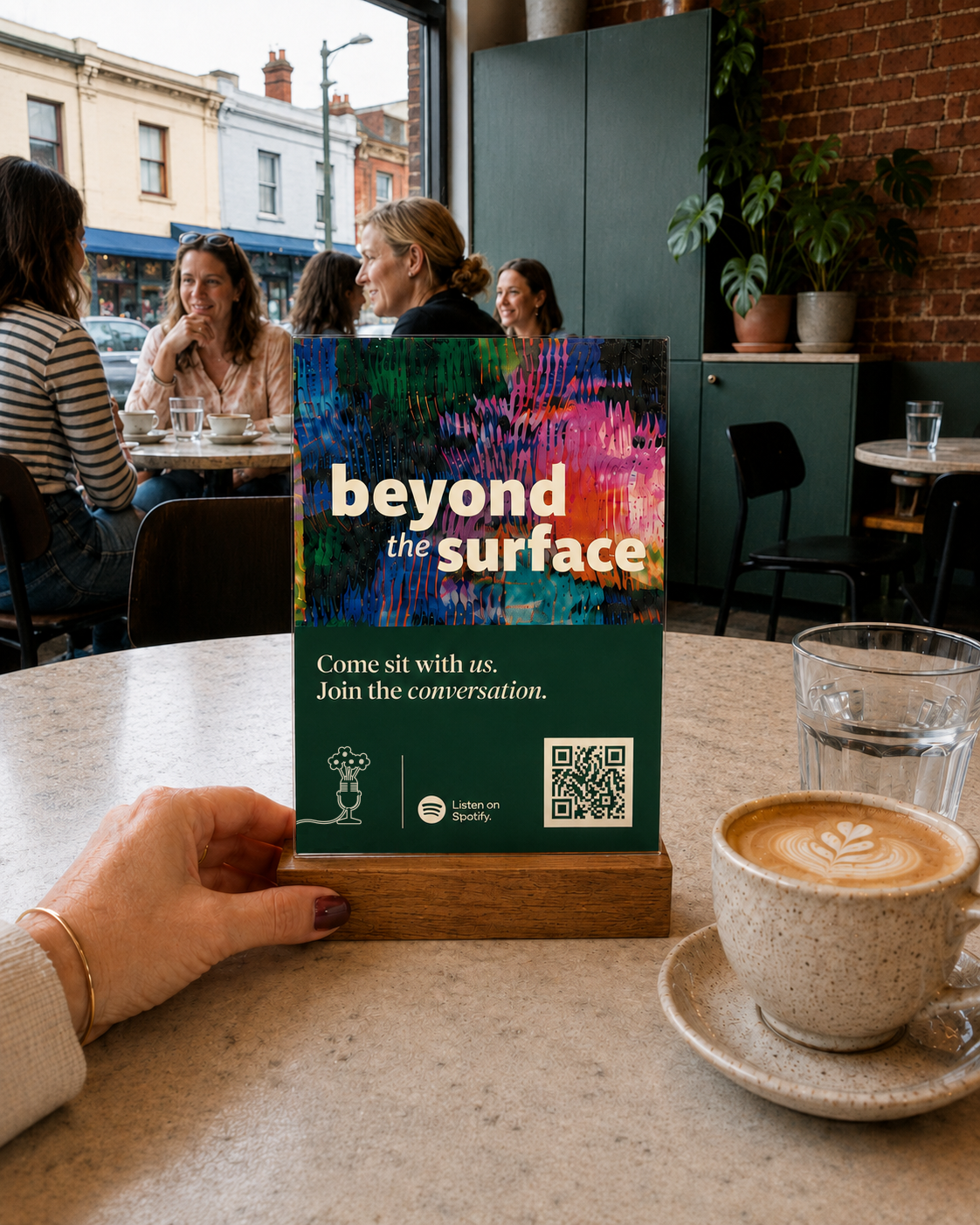
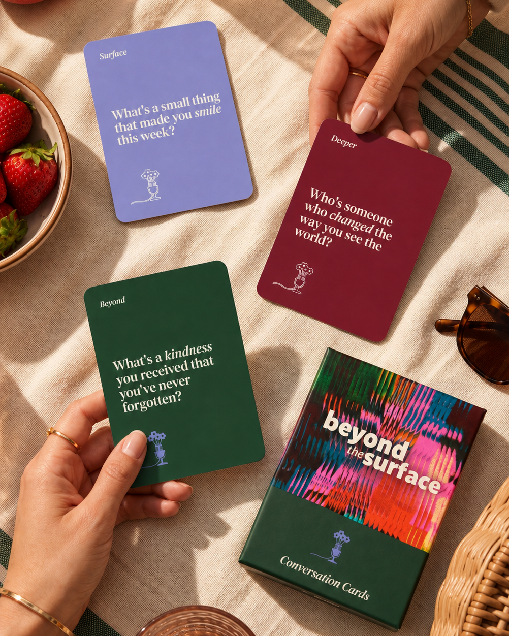
A little peek behind the curtain
This one started with a mood board and a lot of honesty. Muffy wasn't wedded to a single colour — the first palette was a first pass, fed to an AI tool off one example — so the brief was to broaden it, not lock it down. She wears greens and whites constantly, loves how burgundy sits against them, and was clear on one thing: no dark or brown backdrops, because as a woman of colour, she didn't want to disappear into one. That's the kind of detail a mood board catches early, before ten hours get spent conceptualising in the wrong direction.
The tagline took a few passes too. Muffy's original motto was people, purpose, impact — solid, and it still holds as the structural spine of every interview. But it read a little serious for a public-facing line. In session, we landed on something softer: cool people doing kind things. Same intent, more playful, and it doesn't tie the show to one postcode if it ever goes further than Melbourne's west.