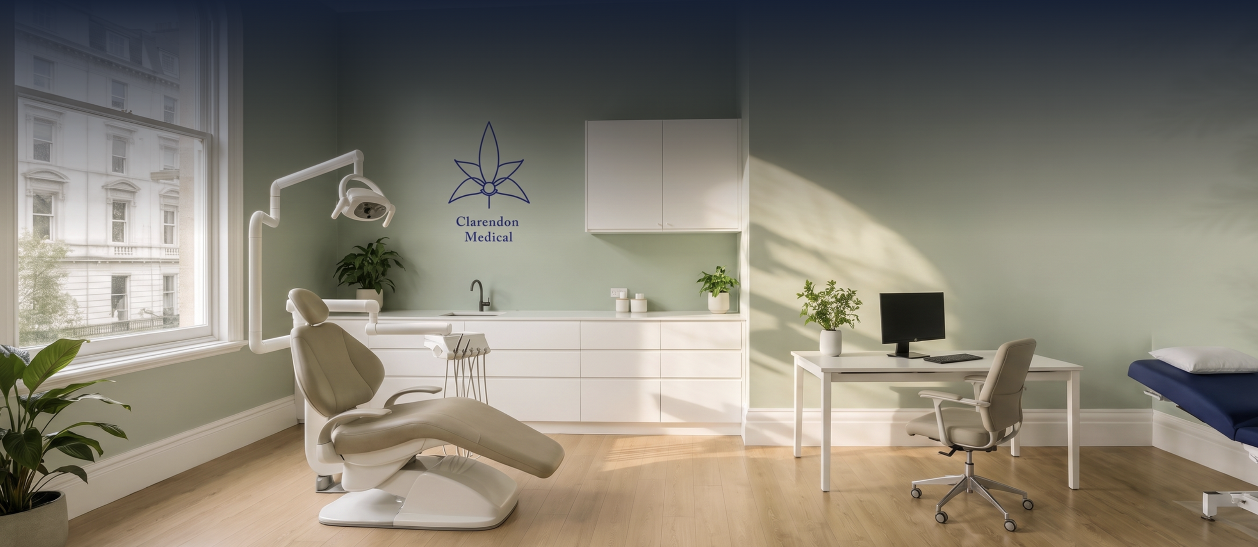
Clarendon Medical
The Challenge
Dr Melvin Goh runs Clarendon Medical from a heritage building on Clarendon Street, South Melbourne, a specialist general and functional medicine practice that also covers IV therapy, iron infusions, hormone health, and aesthetic medicine.
That's a lot of ground for one identity to hold. Cover it badly and the practice reads like three separate businesses; a GP clinic, an infusion suite, and an injectables studio, none quite trusting the others.
It needed one calm, grown-up brand that carried all of it.
A little peek behind the curtain
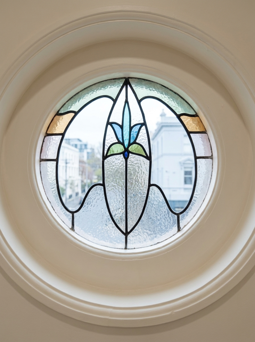
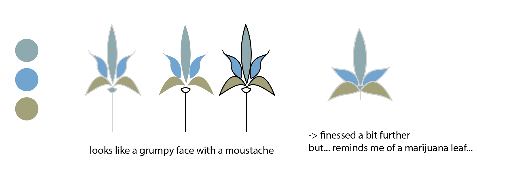
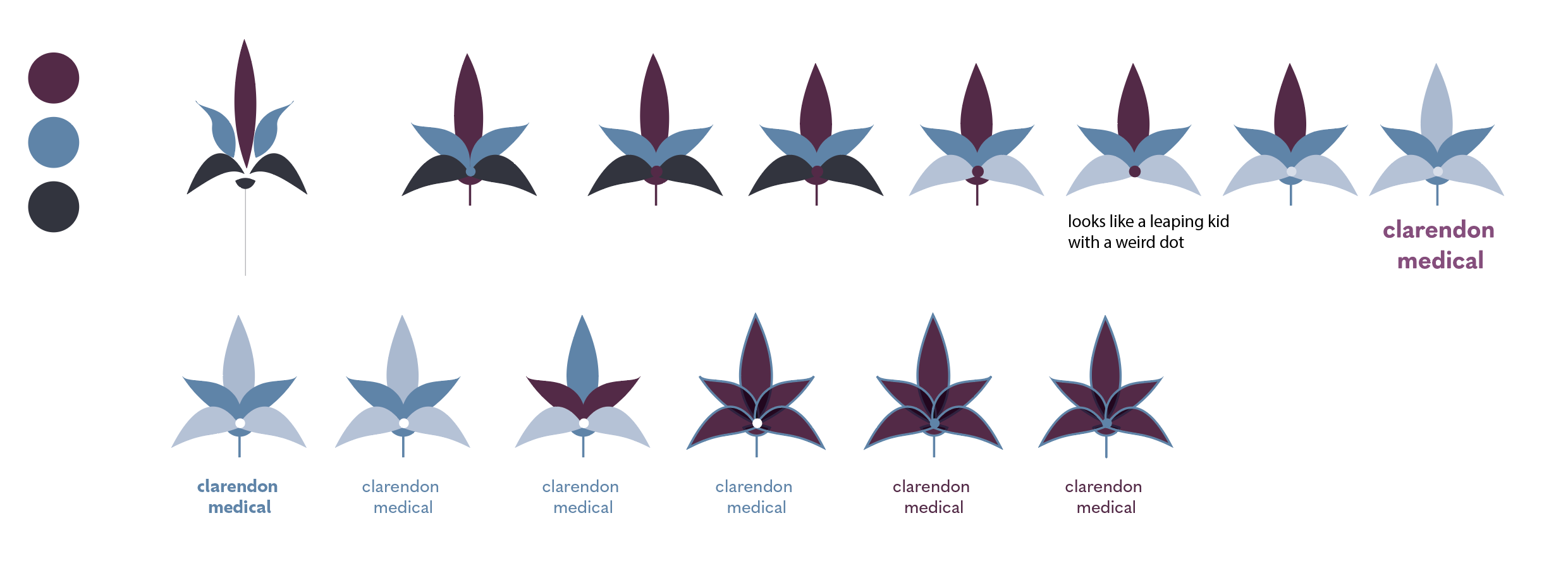
This is often how the work actually goes. A client hands you a lovely starting point, here it was the leaf-form in the building's original leadlight window, and then the real job begins: turning something decorative into a mark that holds up at every size and never accidentally says the wrong thing. A window graphic isn't a logo yet. It has to survive simplification, work in a single line, sit on a lanyard and a wall sign, and clear a long list of things it must never resemble on a medical brand. The screengrab below is the honest working file, notes and all.
The Solution
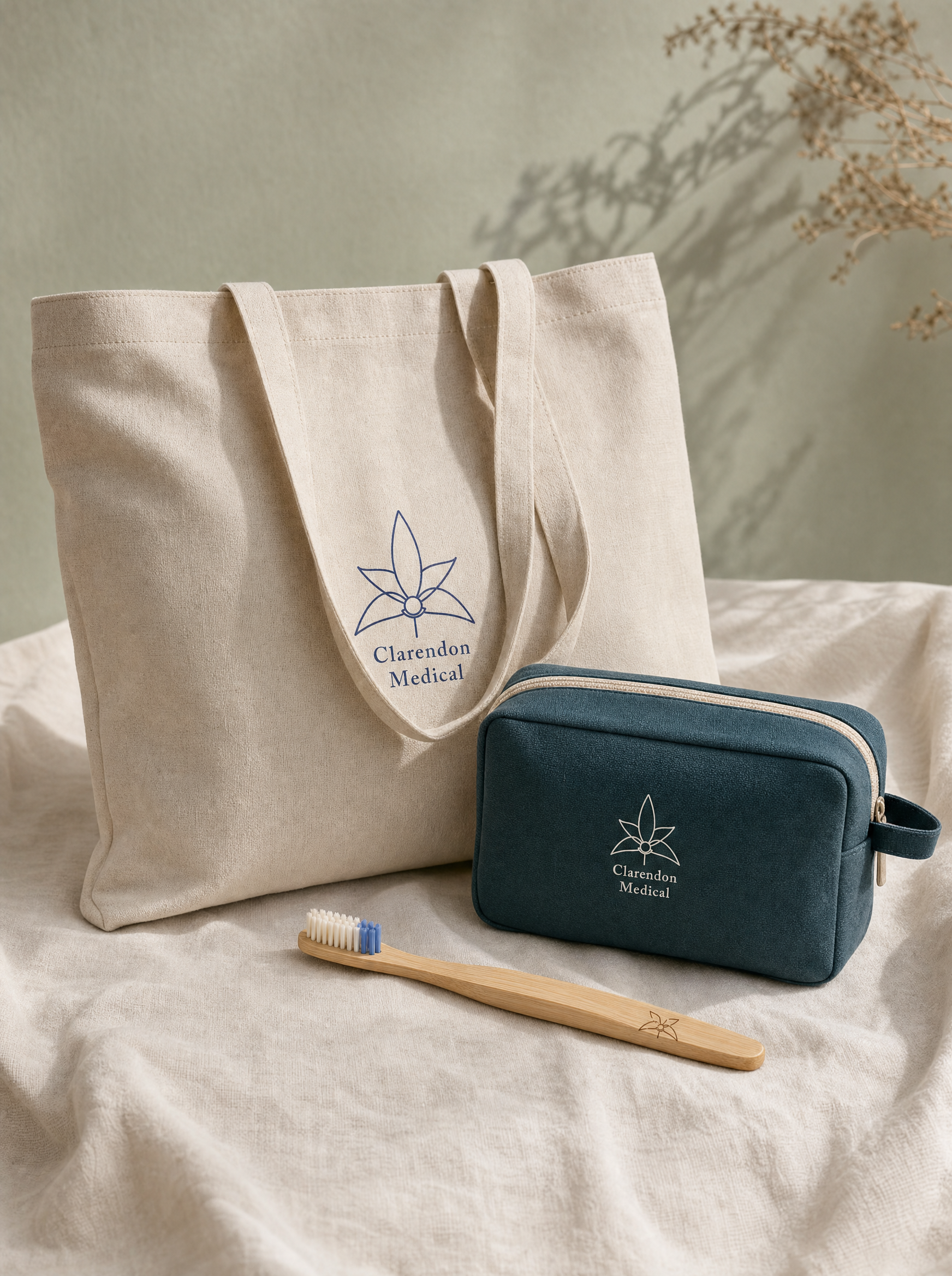
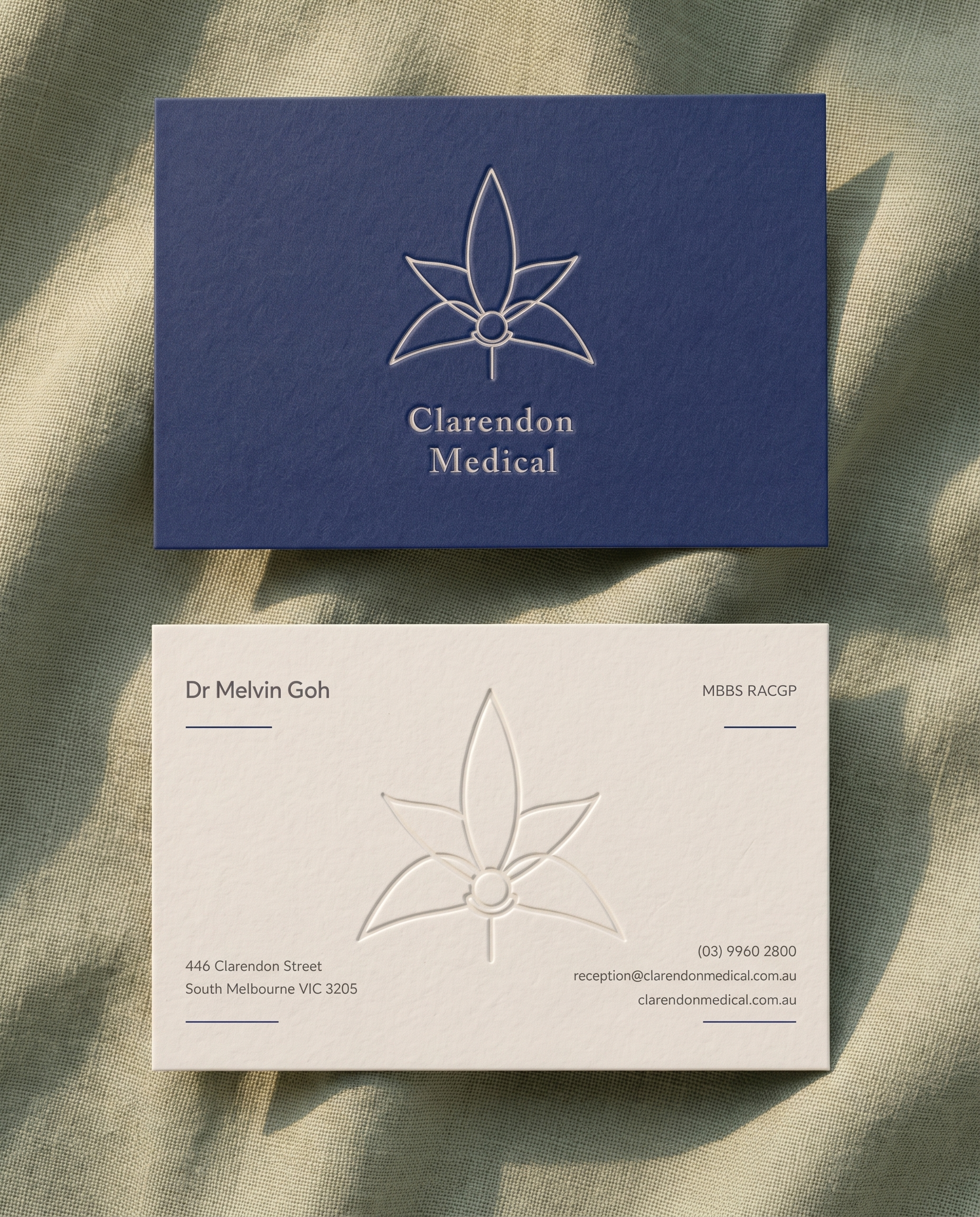
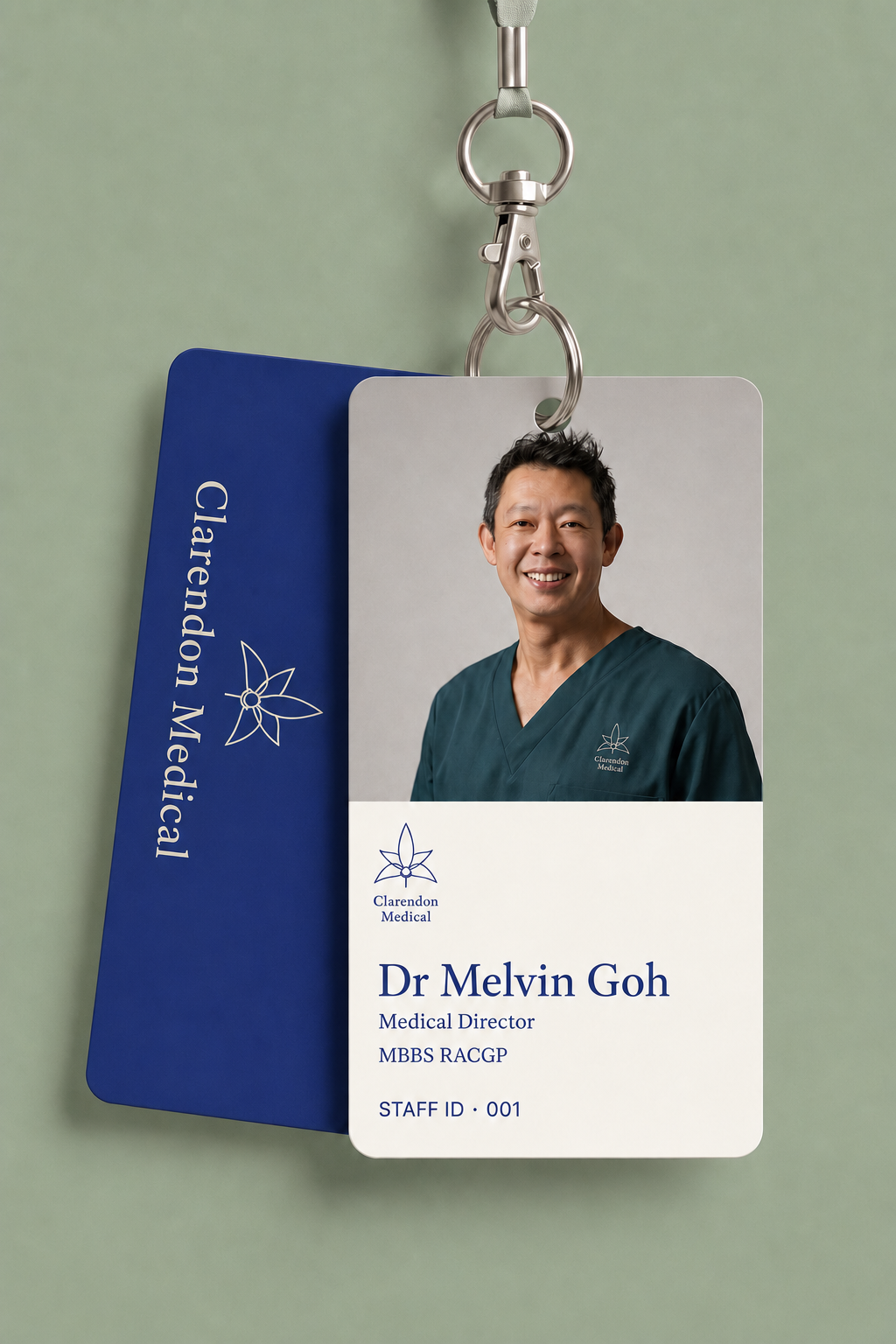
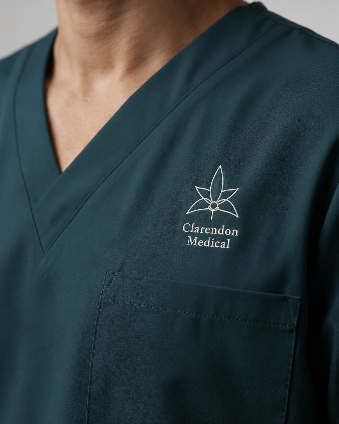
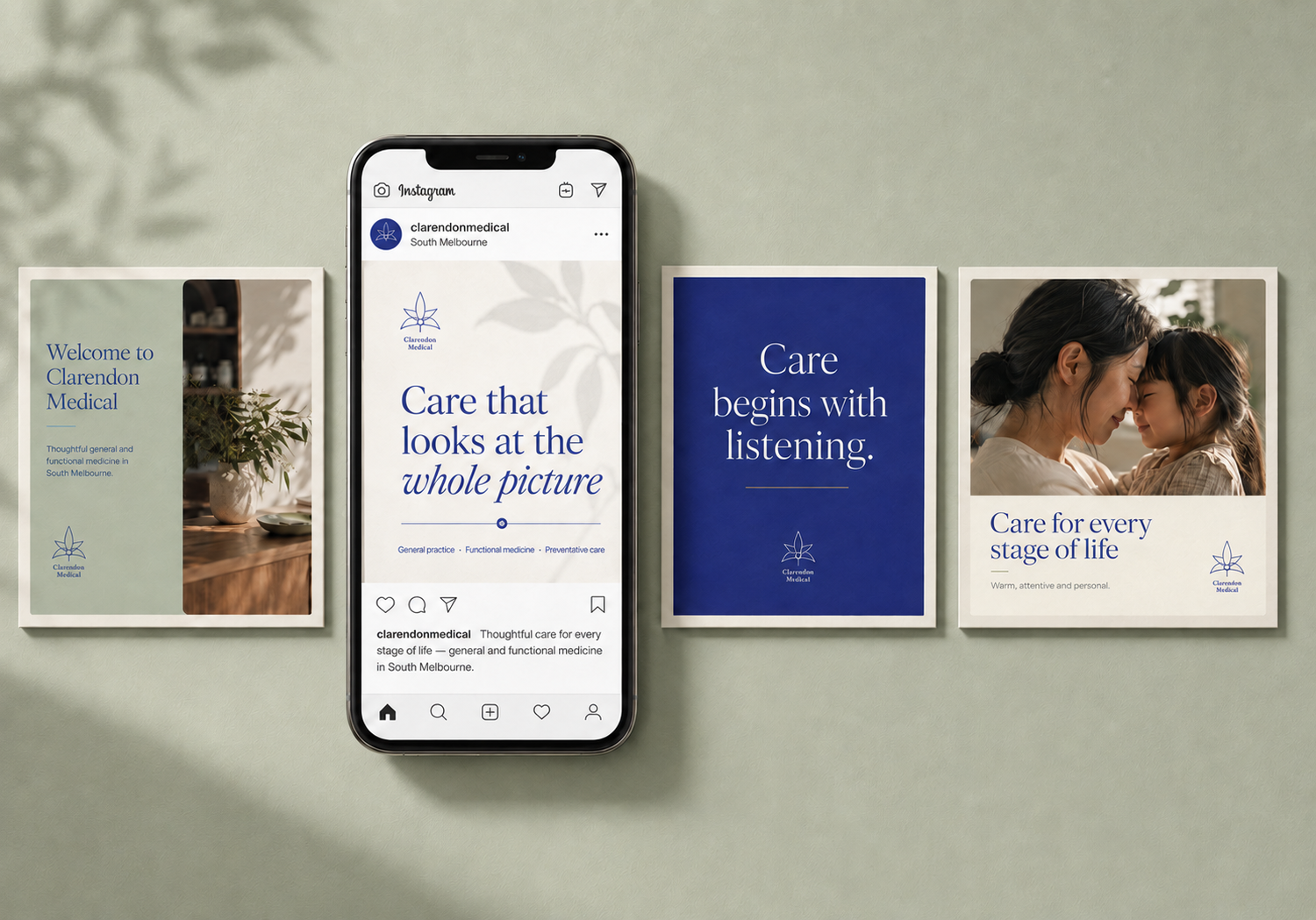
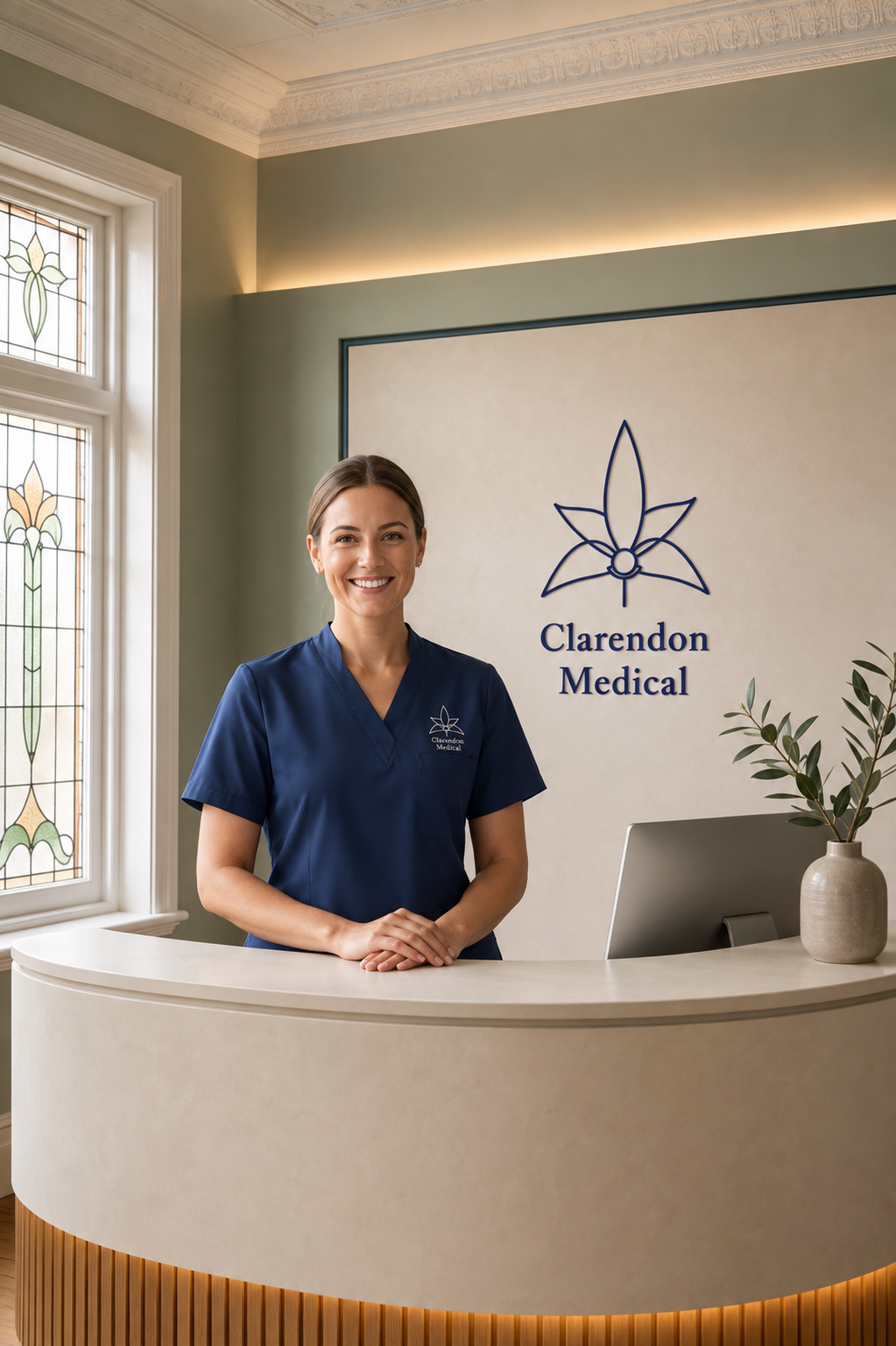
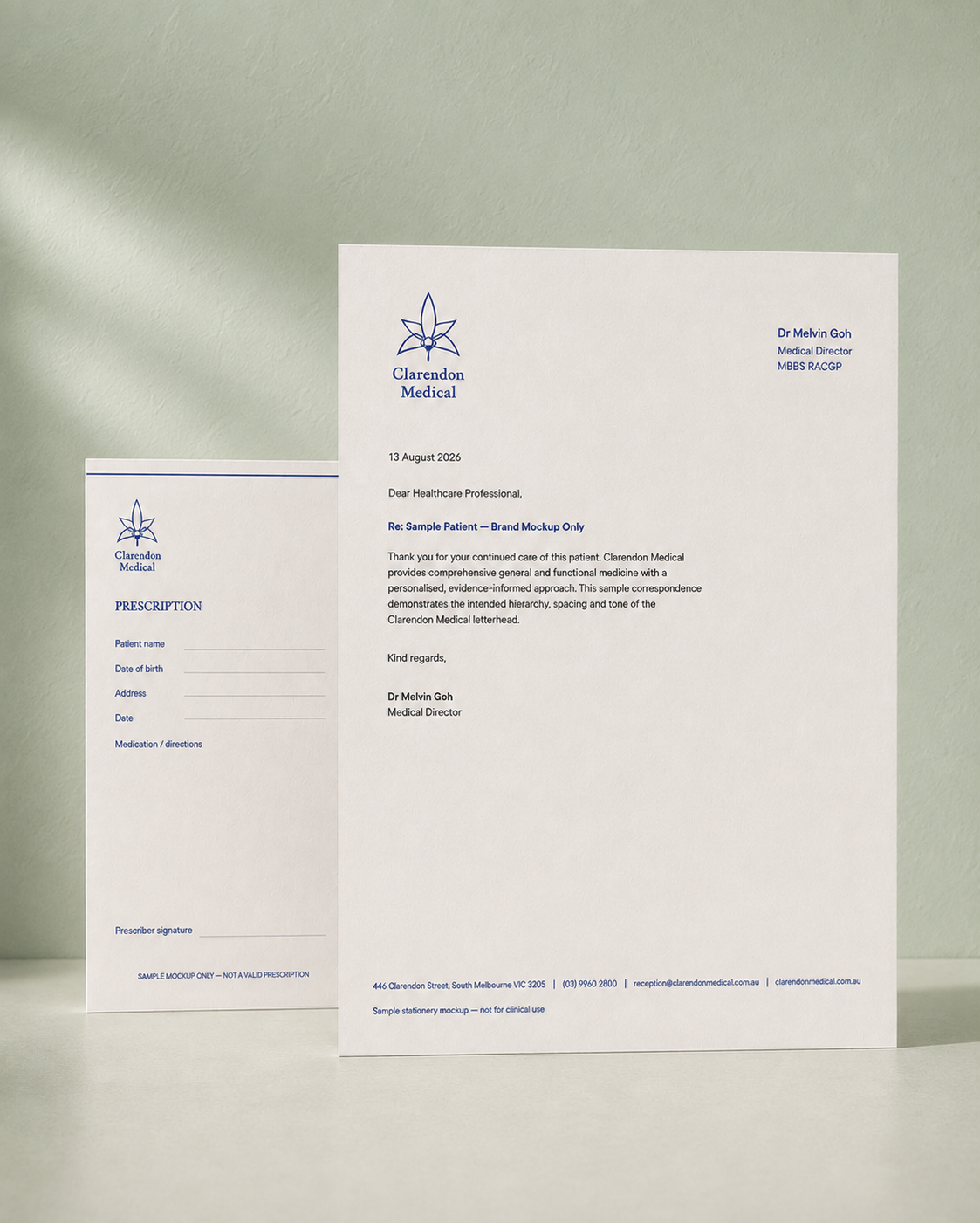
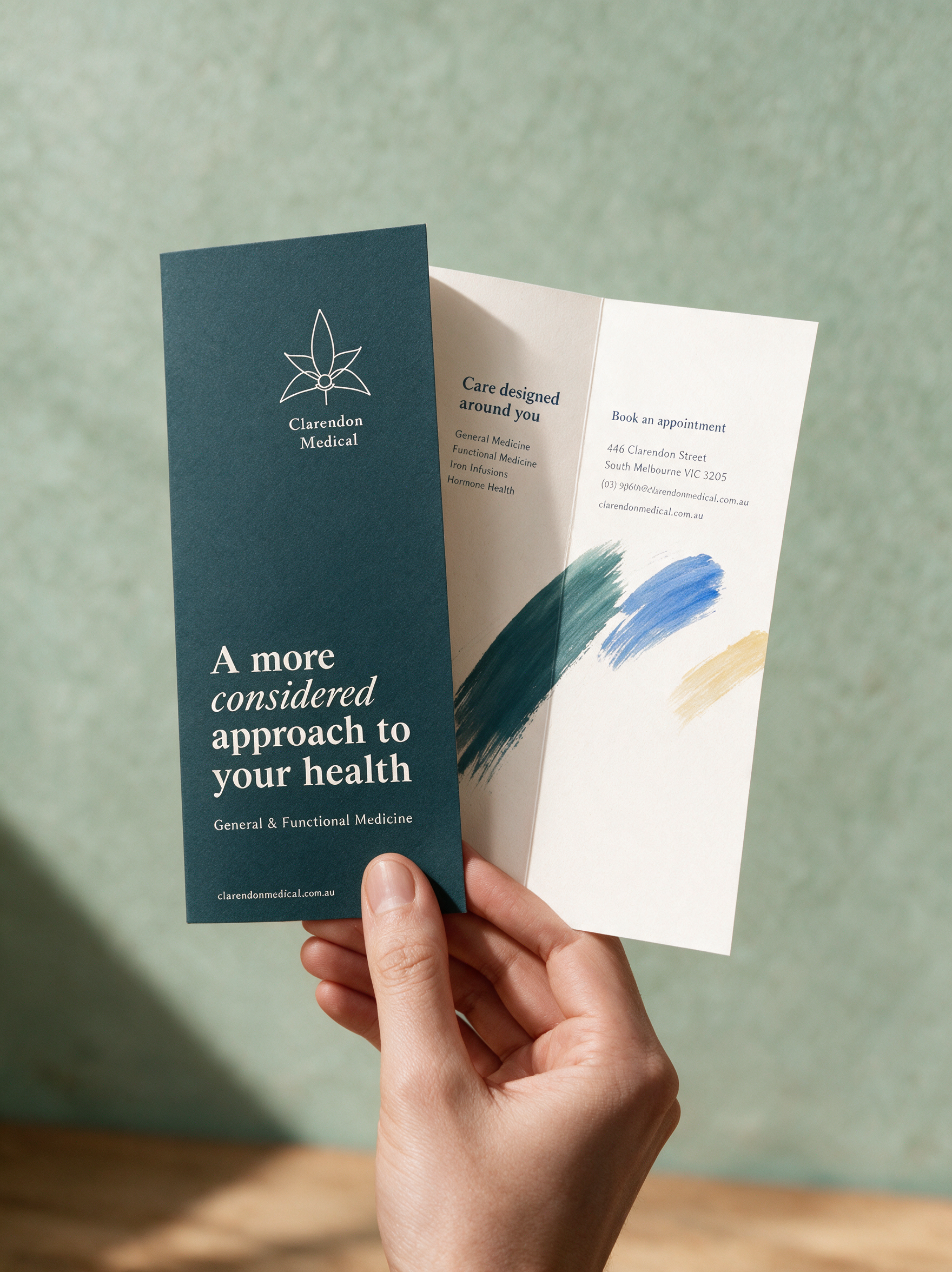
So the mark was already in the walls; the work was drawing it out properly. Deep navy on warm paper, a serif wordmark, and a soft, tactile world closer to considered care than to a waiting room. I built the identity and the full application kit: stationery, signage, scrubs and ID, the patient brochure, tote and toiletry set, and a social system. Everything a practice this broad needs to feel like one place.